
Introduction: Angular Material is a UI component library for Angular applications that provides a set of high-quality and reusable UI components, built according to the Material Design guidelines. It offers a comprehensive collection of UI components, including buttons, cards, forms, navigation elements, and more, to help developers build modern and visually appealing web applications. In this guide, we’ll explore Angular Material in depth, covering its features, installation, usage, and best practices for building stunning user interfaces.
Getting Started with Angular Material: Before diving into the details, let’s start by understanding how to get started with Angular Material.
- Installation:
To use Angular Material in your Angular project, you need to install the necessary packages. You can install Angular Material and its dependencies using npm (Node Package Manager) or yarn. Run the following command in your terminal:
npm install @angular/material @angular/cdk
2. Importing Angular Material Modules:
After installing Angular Material, you need to import the required Angular Material modules into your Angular application. You can import individual modules for specific components or import the MatIconModule to have access to all Angular Material components.
For example:
import { MatIconModule } from '@angular/material/icon';
import { MatButtonModule } from '@angular/material/button';

@NgModule({
  imports: [MatIconModule, MatButtonModule],
  // other module configurations
})
export class AppModule { }
3. Adding Material Icons:
Angular Material relies on Material Design icons for its UI components. You can add Material icons to your application by importing the MatIconModule and using the component.
For example:
<mat-icon>favorite</mat-icon>
Exploring Angular Material Components: Angular Material provides a wide range of UI components that you can use to build your application’s user interface. Here are some of the most commonly used Angular Material components:
- Buttons: Angular Material offers a variety of button styles and types, including raised buttons, flat buttons, icon buttons, and more. Buttons are essential for user interaction and can be customized to match your application’s design.
- Cards: Cards are versatile UI components used for displaying content in a structured and visually appealing manner. Angular Material’s card component provides options for displaying images, text, buttons, and other elements within a card layout.
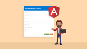
- Forms: Angular Material simplifies form development by providing form field components such as input fields, checkboxes, radio buttons, sliders, and date pickers. These components come with built-in validation and error handling features, making it easier to create interactive and user-friendly forms.
- Navigation: Angular Material includes navigation components like menus, sidebars, tabs, and navigation drawers to help users navigate through your application efficiently. These components are highly customizable and can adapt to different screen sizes and device types.
- Dialogs: Dialogs are pop-up windows used to display important messages, alerts, or interactive content to users. Angular Material’s dialog component allows you to create custom dialogs with various options for styling, animations, and user interaction.
Best Practices for Using Angular Material: To make the most out of Angular Material and ensure a smooth development experience, consider following these best practices:
- Use Angular Material’s theming capabilities to customize the appearance of your application and maintain a consistent design language.
- Optimize performance by lazy loading Angular Material modules and components only when needed, especially in large-scale applications.
- Leverage Angular Material’s accessibility features to ensure that your application is usable and navigable for all users, including those with disabilities.
- Stay updated with the latest releases and updates of Angular Material to take advantage of new features, bug fixes, and improvements.
Conclusion:
Angular Material is a powerful UI component library for Angular applications that simplifies the process of building elegant and responsive user interfaces. By leveraging Angular Material’s extensive collection of components, developers can create visually stunning and user-friendly web applications with ease. Whether you’re building a simple prototype or a complex enterprise-grade application, Angular Material provides the tools and resources you need to deliver a polished and professional user experience. With this complete guide, you’re well-equipped to start using Angular Material in your Angular projects and elevate your application’s UI to the next level.